University theme
This theme offers a simple yet versatile design, allowing for easy customization and flexibility. Additionally, it incorporates a progress bar at the top, which displays the current status of the presentation.
Use it via
#import "@preview/polylux:0.3.1": *
#import themes.university: *

#show: university-theme.with(...)
university uses polylux' section handling, the regular #outline() will not work
properly, use #polylux-outline instead.
Starting a new section is done by the corresponding keyword argument of #slide.
Text is configured to have a base font size of 25 pt.
Options for initialisation
university-theme accepts the following optional keyword arguments:
aspect-ratio: the aspect ratio of the slides, either"16-9"or"4-3", default is"16-9"short-title: short title of the presentation to display on every slide, default:noneshort-author: short author of the presentation to display on every slide, default:noneshort-date: short date of presentation to display on every slide, default:nonecolor-a: main colour of decorations, default:rgb("#0C6291")color-b: accent colour, default:rgb("#A63446")color-c: second accent colour, default:rgb("#FBFEF9")progress-bar: boolean value whether or not to display a progress bar on regular sides, default:true
Slide functions
university provides the following custom slide functions:
#title-slide(...)
Creates a title slide where title and subtitle are separated by additional information by a bright line. Accepts the following keyword arguments:
title: title of the presentation, default:[]subtitle: subtitle of the presentation, default:noneauthors: authors of presentation, can be an array of contents or a single content, will be displayed in a grid, default:()date: date of the presentation, default:noneinstitution-name: name of the institution, default:"University"logo: some content (most likely an image) used as a logo on the title slide, default:none
Does not accept additional content.
#slide(...)[
  ...
]
Decorates the provided content with a header containing a progress bar (optionally), the slide title, and the current section (if any); and a footer containing short forms of authors, title, and date, and the slide number. Header and footer can also be overwritten by respective keyword arguments.
Pass the slide title as a keyword argument title.
Accepts the following keyword arguments:
title: title of the slide, default:none,header: custom content to overwrite default headerfooter: custom content to overwrite default footernew-section: name of the new section that starts here if notnone, default:none
#focus-slide(background-img: ..., background-color: ...)[
  ...
]
Draw attention with this variant where the content is displayed centered and text
is enlarged and bright.
You can either specify a background image or a background colour as keyword
arguments.
If you specify none of them, a background colour of rgb("#0C6291") is used as
a default.
Not suitable for content that exceeds one page.
#matrix-slide(columns: ..., rows: ...)[
  ...
][
  ...
]
Create a slide where the provided content blocks are displayed in a grid and
coloured in a checkerboard pattern without further decoration.
You can configure the grid using the rows and columns keyword arguments
(both default to none).
It is determined in the following way:
- If
colmunsis an integer, create that many columns of width1fr. - If
columnsisnone, create as many columns of width1fras there are content blocks. - Otherwise assume that
columnsis an array of widths already, use that. - If
rowsis an integer, create that many rows of height1fr. - If
rowsisnonecreate that many rows of height1fras are needed given the number of content blocks and columns. - Otherwise assume that
rowsis an array of heights already, use that. - Check that there are enough rows and columns to fit in all the content blocks.
That means that #matrix-slide[...][...] stacks horizontally and
#matrix-slide(columns: 1)[...][...] stacks vertically.
Not suitable for content that exceeds one page.
Example code
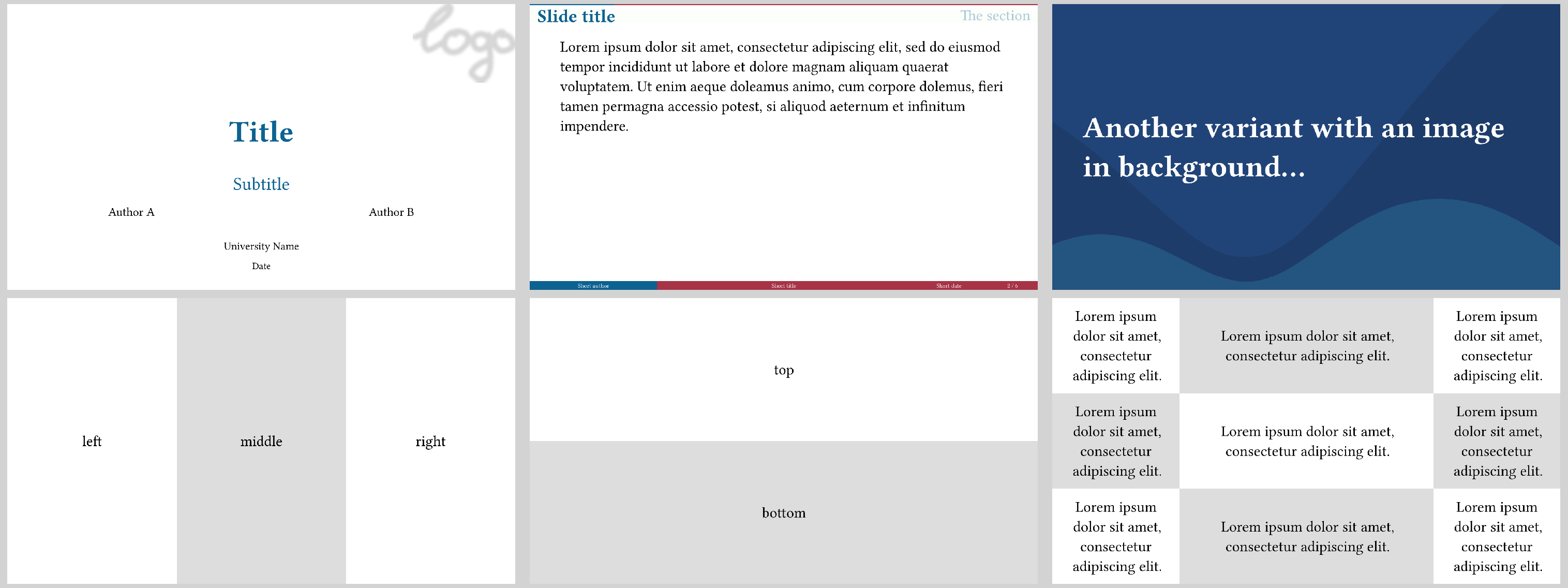
The image at the top is created by the following code:
#import "@preview/polylux:0.3.1": *
#import themes.university: *

#show: university-theme.with(
  short-author: "Short author",
  short-title: "Short title",
  short-date: "Short date",
)

#title-slide(
  authors: ("Author A", "Author B"),
  title: "Title",
  subtitle: "Subtitle",
  date: "Date",
  institution-name: "University Name",
  logo: image("dummy-logo.png", width: 60mm)
)

#slide(title: [Slide title], new-section: [The section])[
  #lorem(40)
]

#focus-slide(background-img: image("background.svg"))[
  *Another variant with an image in background...*
]

#matrix-slide[
  left
][
  middle
][
  right
]

#matrix-slide(columns: 1)[
  top
][
  bottom
]

#matrix-slide(columns: (1fr, 2fr, 1fr), ..(lorem(8),) * 9)